

Summary
- Some fans suggest replacing the square logo with a horizontal one on the Nintendo Switch 2 box art and cartridges.
- They think the current design doesn’t make good use of the wide red banner.
- Others think the current logo helps people avoid confusing it with games for the original Switch console.
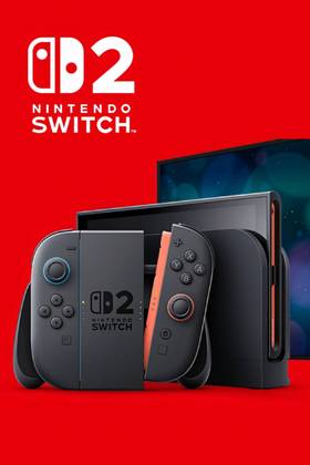
Some fans would like to see a change to the Nintendo Switch 2’s square logo on the box art and cartridges, suggesting a horizontal version instead that would span the wide red banner at the top. The Nintendo Switch 2 release is around the corner, and although most of the new features coming with the console have been met with enthusiasm, players feel a small tweak to the box art and cartridge design wouldn’t hurt.
Nintendo fans had been waiting a long time for the official Switch 2 announcement, and the new console was met with a positive reception. Plenty of rumors surrounded the Switch 2’s development journey, with leaks revealing all sorts of details about the console’s look, design, price, and new games. While many of these turned out to be true, Nintendo still managed to surprise fans with the Switch’s successor, even dropping completely unexpected reveals like The Duskbloods, a new Soulslike game from FromSoftware exclusive to the Nintendo Switch 2. These kinds of surprises, along with the Switch 2’s overall black and more “mature” design, convinced many players - though now, some are hoping for a small change.

Nintendo Reveals New Switch 2 Dock Detail
Nintendo shares an interesting detail about the Switch 2's new Dock that prospective users should take note of when playing games.
A gamer known as SilverPlate_ took to Reddit to share with the community an idea for the Nintendo Switch 2 cartridges, saying they believe the current version doesn’t take full advantage of the wide red banner at the top of the cartridges and box art. Instead of a square logo, they suggested Nintendo should stick to the approach used for the original Switch, where the logo was horizontal, covering the entire red banner on the cartridge. Several gamers chimed in to share their thoughts on the matter as well.
Nintendo Fans Want Horizontal Logo on Switch 2 Box Art and Cartridges
One player commented that they feel the new design aims to emphasize the “2” above the Switch brand - which makes sense as a way to set it apart from original Switch games. Another player agreed with this theory, saying the new design is a good way to establish a clear distinction between the two, helping prevent distracted customers from accidentally buying a game for the wrong console.
Among other significant changes in the new console’s design is how the Switch 2 Joy-Con work; starting with the way the controllers now snap into place magnetically, instead of sliding along a rail. One of the most exciting innovations may be the Joy-Con’s mouse functionality, which will allow players to detach the Joy-Cons and move them across a surface like a PC mouse. While box art and cartridge design might not please everyone, the Switch 2 is shaping up to be a great release for Nintendo.
- Brand
- Nintendo
- Operating System
- Proprietary
- Storage
- 256GB internal / MicroSD
- Resolution
- 1080p (handheld) / 4K (docked)
- App Store
- Nintendo eShop
- Wi-Fi
- Yes